Pitch UR Niche Web Design

Overview
Pitchurniche.com is a crowdfunding platform that helps entrepreneurs to pitch their startup or existing business ideas to individual investors and corporations.
Client
PitchURniche
Scope
Conceptualization
Digital Strategy
UI/UX Design
Motion Graphics

Challenge
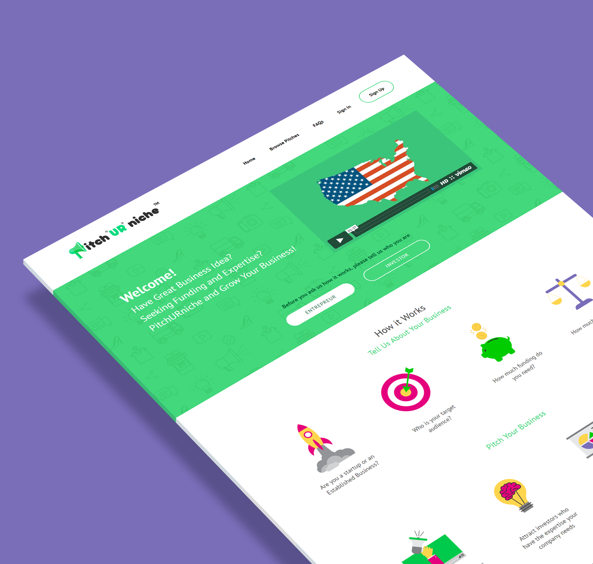
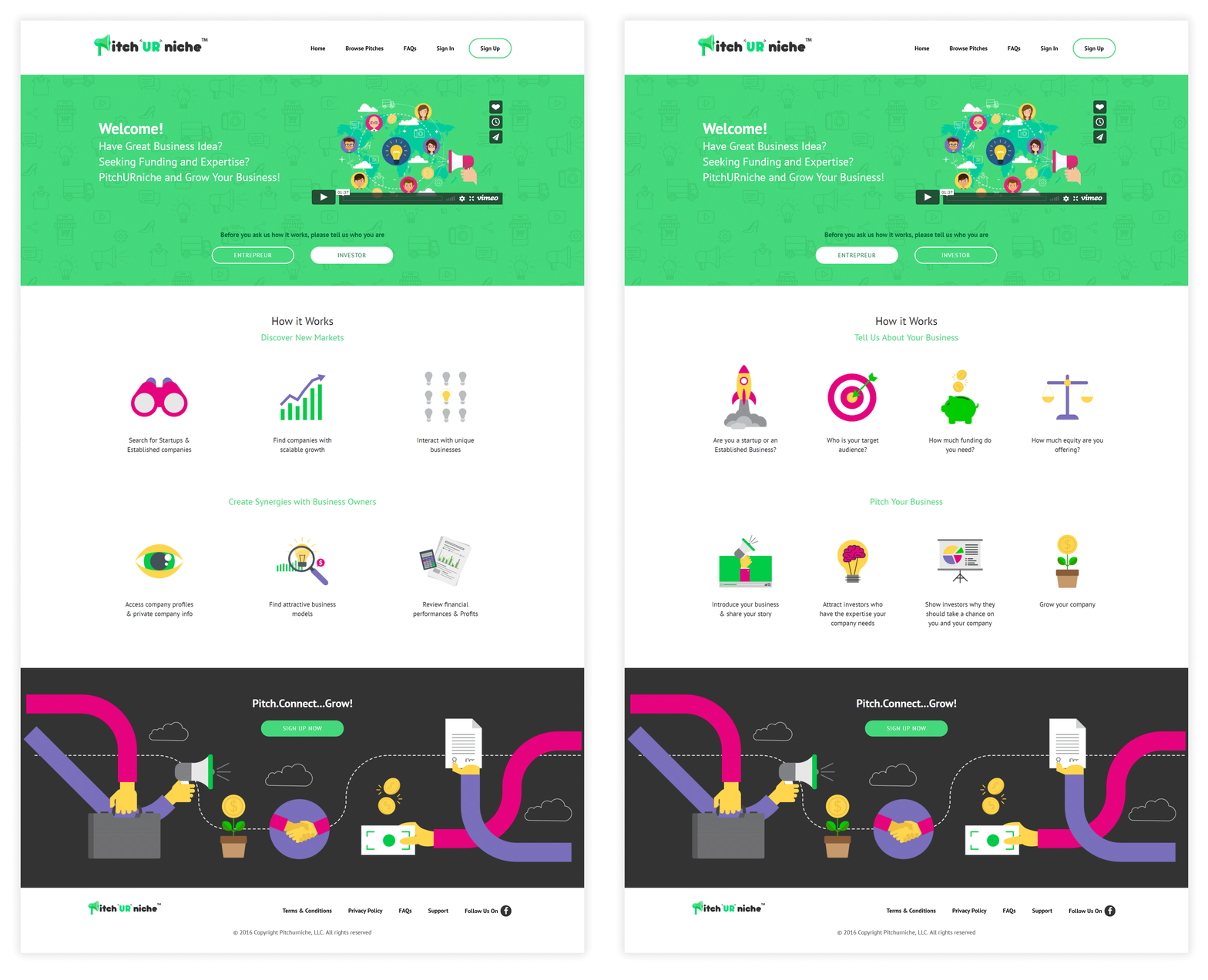
The client wanted us to overhaul the front-end design of the existing prototype they already have built. One specific request was to create a graphic-heavy landing page to engage the audience about their service.

Color Palette
We added new bright colors to complement the green color of the existing logo. As a result, the new colors created a friendly and cheerful vibe that appeals to young entrepreneurs who wanted to start their own business.
Iconography
The bright colors fit well with the icons and made them eye-catching and interesting for the users.

Storyboard
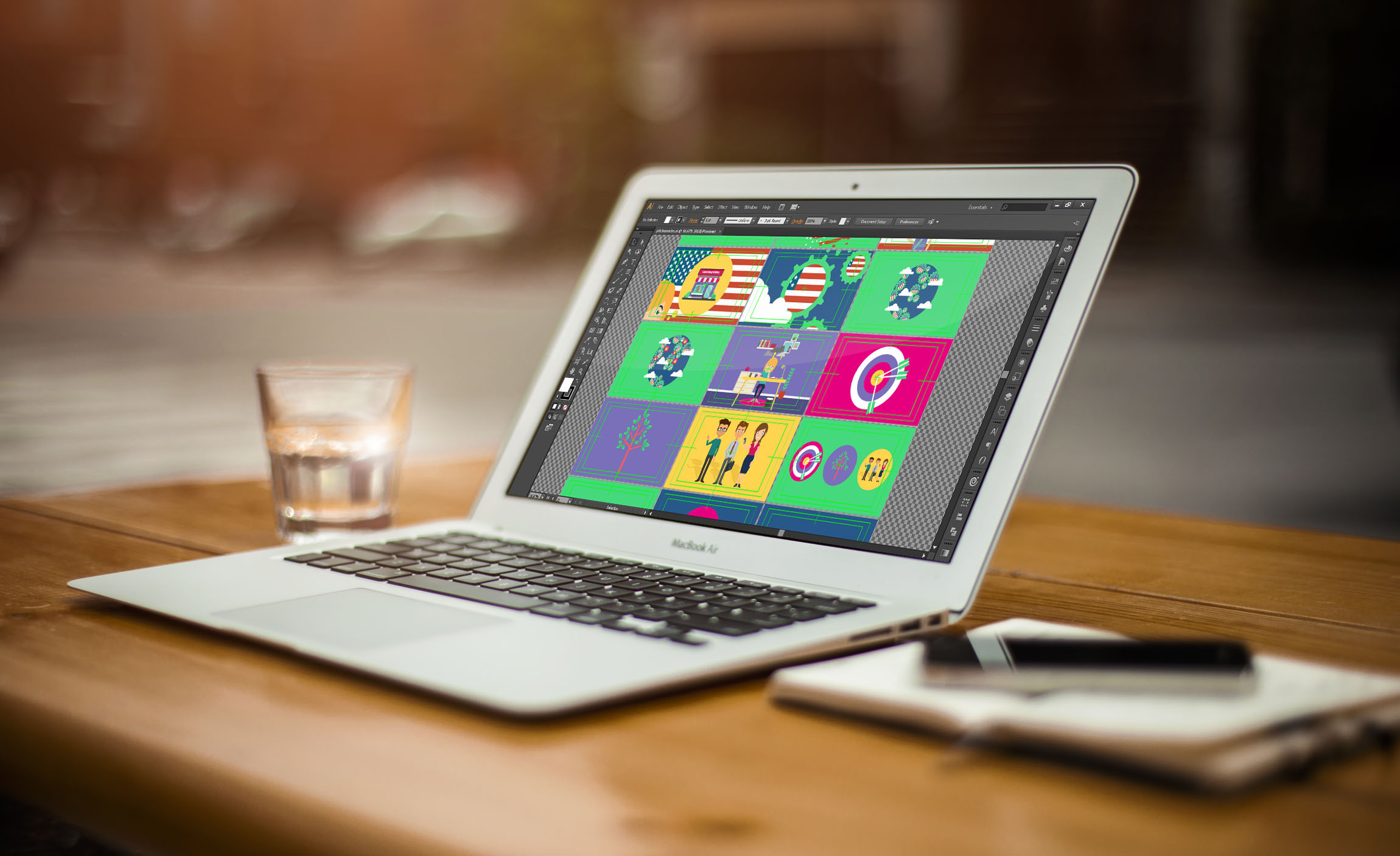
We suggested to create an explainer video embedded into the landing page as a solution to help the audience learn more about the services they offer. The client liked the idea, so he provided us with a script that we converted into a digital animation. A rough sketch of the storyboard was presented first to the client before a digital version was submitted which reflected the final look and treatment of the explainer video.
Explainer Video
Using an explainer video was an effective choice as it removed the limits of device and browser compatibility, audio utilization, user control and loading time.

Engaging The Audience
Aside from the embedded explainer video, another key feature of the landing page is the call to action buttons. There are two notable buttons which allow users choose which category they will fall into when they register: as investor or as entrepreneur. The contents and graphics below the header change as the user selects the category they belong to. Meanwhile, the call to action button at the bottom of the page brings the user to the registration area.
Simple Yet Functional
After doing a research and preparing wireframes, we made a huge improvement on the interface from their old design by focusing on functionality.
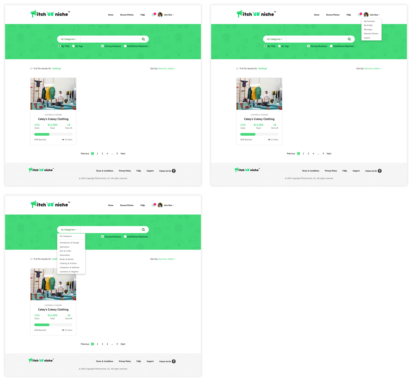
On the header, we added a profile navigation menu where we placed the user’s profile photo, messages, payment history, etc.
We made the search bar more functional buy including filters and categories for easier and accurate search results.
For the results, we opted for a card-based design and functionality that presents an overview of the video pitches. The details that can be seen on the card are the photo and name of the pitch, equity targets, remaining days left for the video to be posted, number of views and the reached goal.
